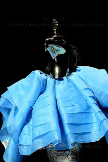
After the research of this three year haute couture collection, I found that John Galliano loves to use double complimentary colour scheme alot, whatever it inspiration is from Eygpt or Chinese. Moreover, He usually put the Black and white in the collection because in the colour scheme anaylsis that I have learnt before, Black and White is not count as a colour and It would not affect the whole harmony flow of the collection and this is what I think about Galliano Design.
In fact I will say that more or less John Galliano may use the same colour scheme in every collection, especially in Haute Couture because J. Galliano is a guy who really good at tailoring and Christian Dior is a brand that play around Design feature such as Classic A-line and H-line dress.
Thursday, 19 March 2009
Analyise of 02 Fall Haute Couture
In this Collection, John Galliano brought back the new glamour to the audience. In this collection, John Galliano used the colour in red, blue, orange and green. And of course, it has black and white in the collection as well. In this collection, we can see that J.Galliano have play a lot of bulky and volume design with the Double Complimentary colour scheme. The combination of the collection were usually in either green with orange, Blue with red, or crossover.
Sunday, 15 March 2009
Scheme of this collection~
The colour scheme of this Ancient Eygpt collection should be Analogic and Complamentary colour scheme because it have used Red + Yellow n Blue +Green, both of these colours are Analogic colour. Moreover, they are the complementary part is the Green with Red + Blue wth Yellow.
Thursday, 12 March 2009
Analyise of 04 s/s Haute Couture
OK!! So as we see, the collections on 04 s/s HC were using the theme of Ancient Egypt Culture. The colour of this collection are based on red, yellow, blue, green, black and white. The reason for that is because the Ancient Egypt artisans used stone to carves status and fine belief, the paint are usually obtained from the minerals such as Iron Ores (Red+Yellow ochres), Copper Ores (Blue+Green), Soot/Charcoal (Black) and Limestone (White).
And John Galliano used them all and even add up some metalic colour, such as gold and silver to recreate a luxury look for the collection because this collection inspired by the Ancient Egypt Goddness i.e. Anubis and Royaltyi.e.Nifertiti
And John Galliano used them all and even add up some metalic colour, such as gold and silver to recreate a luxury look for the collection because this collection inspired by the Ancient Egypt Goddness i.e. Anubis and Royaltyi.e.Nifertiti
Tuesday, 10 March 2009
03 s/s Haute Couture Collection Analyise...
In this collection, John Galliano created a whole new combination of Asia beauty after he recently returned from a three-week trip to China and Japan. He showed that the smashed cultural boundaries in a spectacle of gargantuan theatricality. Moreover, the multicoloured volumes of fabric that mixed East and West, ancient and modern, were showcased amid appearances from Chinese dancers and circus performers.
In the colour usage, John Galliano had a colour celebration in here and he used almost every single colour. Although it is hard to tell which colour scheme he used in this collection, I will say that he used a Split Complementary colour scheme with boost up the redish colour because of the Chinese element.
In the colour usage, John Galliano had a colour celebration in here and he used almost every single colour. Although it is hard to tell which colour scheme he used in this collection, I will say that he used a Split Complementary colour scheme with boost up the redish colour because of the Chinese element.
Thursday, 5 March 2009
Some interesting scheme about colour
Monochromatic Color Scheme: This scheme uses the same color (hue) but changes the brightness and saturation to achieve different shades and tints. eg. yellow in different range of hues. (yyyyyyy)
Analogous Color Combination (Analogic Color Scheme):
This scheme uses the neighbour colour, which have a little contrast and relatives on the colour wheel. eg. violet n red n orange
Complementary Colors:
Colours that Combing a shade, tint or tone of one color and the color opposite on the wheel, which I will say is a contrast colour. i.e.
Split Complimentary Color Scheme
Similar to complimentary but chooses the adjacent colors 30º each way of the compliment.
i.e. Yellow with red violet and Blue violet.
Analogic and Complimentary Color Scheme
This scheme uses the analogic colors scheme and includes the complimentary color.
Double Complimentary Color Scheme (Diad):
Triadic Color Scheme:
Analogous Color Combination (Analogic Color Scheme):
This scheme uses the neighbour colour, which have a little contrast and relatives on the colour wheel. eg. violet n red n orange
Complementary Colors:
Colours that Combing a shade, tint or tone of one color and the color opposite on the wheel, which I will say is a contrast colour. i.e.
Red with Green, Blue with Orange and Yellow with Violet.
Split Complimentary Color Scheme
Similar to complimentary but chooses the adjacent colors 30º each way of the compliment.
i.e. Yellow with red violet and Blue violet.
Analogic and Complimentary Color Scheme
This scheme uses the analogic colors scheme and includes the complimentary color.
i.e Red, Orange, Yellow with Blue
Double Complimentary Color Scheme (Diad):
Two colour which is analogic colour with there complimentary colour.
For example, Red + Orange with Green + Blue
Triadic Color Scheme:
This scheme uses the colors at 120º around the color wheel (360º).
e.g Green+Violet+Orange
Achromatic scheme:
A simple, classic scheme that we use usually, which is Black, Grey and White...
Subscribe to:
Comments (Atom)


